

Your Brand Has a STYLE
The visual identity system of your brand is frequently the first impression that your customers process. From packaging to coloring to fonts, this system creates the foundation for your brand's personality that the verbal identity system will complete.
First, Inspiration
Collected from the very place where your work began, here is a curation of raw images that aesthetically represent your visual language. From handwritten typography to succulent and floral imagery to the colorful desert palette, these photos reflect the beauty of your brand.


.jpeg)
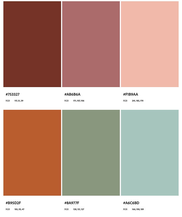
A PAlette
Crafted to evoke a desert in sunset, these colors are pulled from your products and the energy of your brand. Using Sedona, Arizona as a visual source, they range from the orange and reds of the earth to the succulent brush that lines the soft rush of the creek. To combine the physical location of the brand and the products created results in a touchstone palette that is congruent with the heart of the brand.
A TYPE
Your main typefaces for print and digital are Roca Regular and Fredoka respectively. These fonts are perfect for headers, with the sans serif Fredoka being consistent across Adobe, Canva, and Google. For Microsoft, the font Kodchasan is a good alternative. The serif Roca Regular is available on Adobe and Canva, closest to Young Serif on google and Plantagenet Cherokee on Microsoft. For both font types, a thicker sans serif does well for the body, whether it be a continuation of Fredoka or a Gill Sans.

YOUR BRAND BOARD
Your Brand Board is the combination of the above factors, demonstrating your color palette, your typography, and your evokative imagery.

Your LOGO SYSTEM
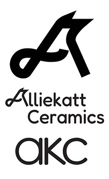
This updated logo system, paired with your current stamp of the bird skull, brings a slightly modernized angle to your artistic brand image. The letter A turned into a cat with its ears and tails can be integrated into the Fredoka wordmark. That Fredoka font is carried down into the lettermark.
When it comes to your logo guidelines, there is much more you can do than you can't. Don't be afraid of colors, of course, but contrast is the key. Since creativity and color are your brand, it's important that the colors stand out. Without that contrast, your logo will disappear into the noise.

